Friday, December 3, 2010
Artist 18/20: Don Bluth

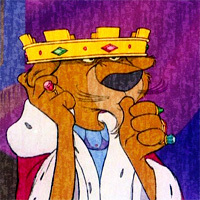


His first full-length film was The Secret of NIMH. This is among one of the most dark widely-known animated films that is hardly aimed at just adults. With blatant elements of death and torture it served as a cautionary tale to the scientific testing of animals and illustrated the less than fair balance of life animals must share with humans. Another film he made with the production help of Steven Spielberg is An American Tale which paralleled the hardships of turn-of-the-century jewish immigrants and the relationships between mice and cats. The subject matter is incredibly mature and even I didn't understand the cultural and historical references until I was in my late teens. Because of this, the films has garnered mixed reviews. I for one appreciated the fact that it treated it's audience like adults and gave us the benefit of the doubt that we could handle it's dark material. His third film which is my personal favorite animated film was The Land Before Time. Once again this is a film that centers around the nondiscriminatory spirit of youth and the benefits of working together. I didn't realize this was an allegorical film about racial tolerance until several years ago.
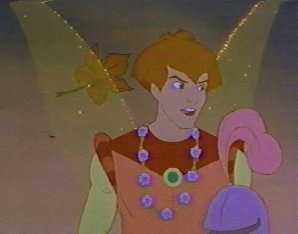
Don Bluth has long since gone down hill with realesing Disney formula knock-offs like Thumbelina and Anastasia. Then he began dumbing his stories down to appeal to a much younger audience with films like A Troll in Central Park and The Pepple and the Penguin. What happened Don Bluth. You once used to respect your viewers and was more about focusing our attention by having potent social commentaries atop an enigmatic almost abstract background. Another thing that I somewhat appreciate about Don Bluth, while at the same time disliking it, is the fact that he had an active hand in the design and animation of his films' characters. I like that because he can claims some of the credit. HOWEVER....MANY of his characters seem to have obnoxiously similar hair styles Well there you have it. Don Bluth.



Thursday, December 2, 2010
SMALLTOWN ROMEO - PARTY MOTION

After much fanfare and a long wait, tomorrow is the date, our new single Party Motion will be coming out on Plant Music available exclusively at Beatport.com
Here is what our label Plant Music has to say about it:
“As expected, the boys have created a tune that reflects their all-over-the-place musical tastes, from disco to hip-hop to house to electro, and this one is suitable for many different dance floors. The package comes with the much sought-after Malente remix which has already seen massive support from Diplo as well as tastemakers like Brodinski, Drop The Lime and Sinden. This mix should come with a face-melt warning. Don’t say we didn’t give you a heads up! In Flagranti, always sure to take things in a unexpected direction, comes through with a mix that veers the song towards disco but really stomps – a disco stomper? Yes. Stones Throw’s James Pants delivers a crazy tropical bass workout that is quite a departure from anything he’s done thus far – slightly left field, clever but dance floor friendly at the same time. Finally, Plant newcomer Grandtheft turns “Party Motion” into big room electro house but as always, keeps it classy. What’s that, did you just ask about the “Party Motion” video? After the sensational animated video for “Boom-Ha” it only makes sense. Rest assured, it’s almost in the can, again directed by Matt Luckhurst!"
You can check out the full EP here (and remember to buy it on Beatport tomorrow!):
Party Motion by SMALLTOWN ROMEO
Wednesday, December 1, 2010
Artist 17/20: Michelle Robison
Well I noticed just now that my favorite artists list is one big sausage fest. I apologise for this. But I wonder, why are there so few high-profile female artists in the world. Fine artists that is. So to try and make up for it, I think my final few artist entries will be about female artists ...unless I remember another artist who I REALLY like that just happens to be male. So for this entry I found a rather obscure artist who specializes in jewelry. Now I don't really wear jewelry. The only thing I have is this little hemp beaded bracelett on my left wrist and the only reason it's still there is because I can't get it off. The few pieces of jewelry (rings or necklaces) have been lost because I could remove them easily and lost them somewhere. I digress. This woman's style caught my eye because it has a bit of a spooky look to it while having some familiar elements of Art Nouveau. Such is the work of Michelle Robison.
 Every single piece of jewelry she makes is a one of a kind and usually has a theme in relation to the cut gem is showcases. Upon close inspection you'll notice that her jewelry is actually tiny sculptures which hold the gems in place. This is an example of her work. It is a ring which he entitles Mermaid Fantasy. In the center is a deep blue sapphire surrounded by several mermaids as well as bits of coral and shells. I appreciate the intricacy but I loved the ring (even a bit more) when I didn't realize what those shapes were and instead I thought it was just a random organic looking mass.
 Michelle Robison, as it would appear, isn't jut limited to jewelry. Another rather arbitrary piece of hers caught my eye and took me several minutes do decide how I felt about it. Knew I liked it but why? It's called the Herald and obviously it's an angel. Most angels are white, soft, and glowing. This one is blue, dark and almost cold looking. It struck me that we generally associate Heralds (especially in the bible) with good news. But by definition there is nothing to say that a Herald can't bring bad news. Either way,if an angel looked like this it would scare the shit out of me which is strange since when you look at the shape it's actually quite beautiful. It also is one of the few sculptural pieces sprouting out of a wall frame that I actually like. Usualy I find them tacky or down right frightening but because it's so bizarrely formal looking. I lik it. Not sure if I'd hang it in my home but I like it.


 Michelle Robison, as it would appear, isn't jut limited to jewelry. Another rather arbitrary piece of hers caught my eye and took me several minutes do decide how I felt about it. Knew I liked it but why? It's called the Herald and obviously it's an angel. Most angels are white, soft, and glowing. This one is blue, dark and almost cold looking. It struck me that we generally associate Heralds (especially in the bible) with good news. But by definition there is nothing to say that a Herald can't bring bad news. Either way,if an angel looked like this it would scare the shit out of me which is strange since when you look at the shape it's actually quite beautiful. It also is one of the few sculptural pieces sprouting out of a wall frame that I actually like. Usualy I find them tacky or down right frightening but because it's so bizarrely formal looking. I lik it. Not sure if I'd hang it in my home but I like it.
 |
| Creepy! |
Blog #26: Proposals Selected
 So. Yesterday we gave our Final Project proposals and mine was among the selected. Yay. Go me! While this makes me a little smug, I'll be honest and say I'm a little bit bummed. By having your project selected means that you're stuck doing it and there were some other projects I think I would have had a lot more fun doing than my own.
 Also, I wasn't aware that we would be split up into groups of three. I was thinking this project was going to be easy since everyone would only have to bring maybe one to two pieces to contribute. Nope. Now if we want an extensive collection we three will have to bring in four to five pieces. Really not a huge deal by anymeans. My project probably requires the least amount of craftsmanship. Rather we have to rely on creating and indicating story to get the viewers fascinated about these seemingly ordinary objects.
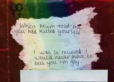 I recall, the advise given was to try and establish a continuity in the types of messages found. Knowing me, I think I'll stick to tragic stories. Some of the objects might seem comical in appearance (a rubber duck for example) but the message attached will be of a sincere nature. They don't all have to be sad necessarily but I think most of the messages have to be dire. They aren't meant to be trivial messages sent for a cheap laugh but to allude to a story of a person being pushed to emotional extremes. Again either they want to be found and in which case there will be a label saying whether the sender was indeed found (dead or alive) or whether the message was for sheer anonymity very much like the secret post cards which were actually one of the inspirations for this installation.
 Artist 16/20: Alan Lee
 |
| Alan Lee |
WHOOPS! So I went on for a week and totally forgot to do a seperate entry on Alan Lee. Here we go.
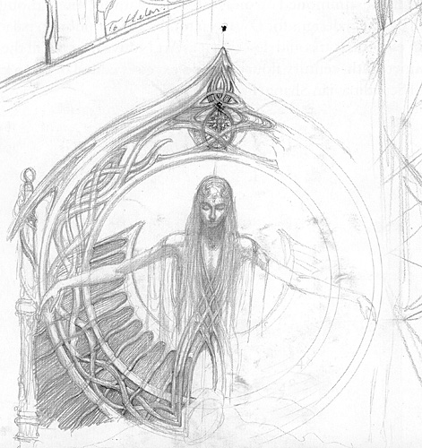
Alan Lee is a English born artist and shares the same affinity for fantasy subject matter. However, if I had to choose a preference I would have to pick Lee's jagged watercolor style over Howe's more smooth acrylic. I'm not entirely certain if both artists where in kahoots with eachother prior to their work on LOTR but they have been confirmed in their involvement with the impending prequel The Hobbit. Yay! Alan Lee has worked closely with another of my favorite British artists Brian Fraud who was the artistic director behind Jim Henson's The Dark Crystal and Labyrinth which I have mentioned in an earlier blog. But their visions have such a spooky yet magical and earthy quality that makes their work appear as though it could be easily real or at least depicting very real places and things. Another reason I like Alan Lee is that his rendition of Elven architecture is very similar to the style of Art Nouveaux where the buildings look as though they are one with the flora, as though they could have grown themselves.
Alan Lee is a English born artist and shares the same affinity for fantasy subject matter. However, if I had to choose a preference I would have to pick Lee's jagged watercolor style over Howe's more smooth acrylic. I'm not entirely certain if both artists where in kahoots with eachother prior to their work on LOTR but they have been confirmed in their involvement with the impending prequel The Hobbit. Yay! Alan Lee has worked closely with another of my favorite British artists Brian Fraud who was the artistic director behind Jim Henson's The Dark Crystal and Labyrinth which I have mentioned in an earlier blog. But their visions have such a spooky yet magical and earthy quality that makes their work appear as though it could be easily real or at least depicting very real places and things. Another reason I like Alan Lee is that his rendition of Elven architecture is very similar to the style of Art Nouveaux where the buildings look as though they are one with the flora, as though they could have grown themselves.
 |
| Alan Lee |
Creatures of fantasy, myth, legend, and fairytales were always my favorite subjects growing up. Mermaids, dragons, fairies, unicorns, pegasus, fauns, dryads and whatnot where typically what I mostly drew from age 6 to about 16 when I found out how little appreciation there is for that type of art. Since then I've geared my work towards wildlife and portrature. Nontheless, both Lee and Howe have a very distinct sketching style that I've found is very similar to mine. Quite often we start a concept sketch and get so entrenched in the possibilities of detail that we forget the piece is only meant to be temporary and used as reference. So its sometimes very hard to part with a sketch once you've finished. This is one of the reasons shy away from sketches as I tend to go too far and grow too attached.
 |
| Mine |
Subscribe to:
Posts (Atom)


