Tuesday, September 28, 2010
Blog #13: Crayon Purse Report
Right well..... So I think I've worked this little bastard out. After a good half hour walk to the nearest known thrift store I managed to find exactly what I was looking for: Two little coin purses with them little snappy metal clamps. With some nervous wielding of a very sharp knife I was able to liberate the cloth/plastic sack from the metal on one of them. From that I had a basic pattern for cutting out my crayon box. To get the size and look. I want I'm gonna have to most likely sew two pieces together. But how the hell does one sew cardboard?
So I had to find a way to treat the cardboard so it would be more flexable and durable. This was a pleasant case were my first experiment proved to work. I disassembled the cardboard box and got it wet. I then crumpled the cardboard into a soppy heap and then carefully flattened it out as not to rip it. Then I repeated this process a few more times until the material had been thoroughly creased. Then I dried it out in the oven. The result is a leathery paper that has still retained it's printed surface. However, to make it just a bit more durable I'm going to later attempt soaking the brown side with a clear wax. I'll take some wax shavings, sprinkle it on the brown side, stick it in the oven and let heat and osmosis do their thing.
The coins were more little pains in the tucus. First, I tried making molds from sticky tack....no good. I'd make a print of the coin, pour the wax in which would dry but then not come apart from the tack. Then, I tried heating the coins and dropping them on plastic....no good. Too hot and the coin just melted right through. Too cold and the coin did nothing. So then I realized the wax didn't stick to the coins themselves and I figured it were the images that people recognized on our coins more than the writing so I've gone with that. also to keep the wax from spilling all over the place I'm using parts of an orange prescription bottle as a well. So I'm pouring wax on one side of a coin and popping it out. Then I do the other side. With the remaining wax I stick the two pieces together. Wear the sides down appropriately and then I apply the original crayon wrapper back on with the cunning use of hairspray. That stuff is AMAZING!
My Dad's New New Mixtape

My dad is always writing down playlists and new songs in his notebook. Then when he has about 100 or so compiled he will usually narrow them down to fit on one mix. Then he puts them on his ipod and it becomes the soundtrack to his life for a while. This is the latest playlist, and this time he got our good buddy & dj Ivan Rankic to help him out and string them together into a continuous mix. The result is pretty awesome.
Al Emes feat. Ivan Rankic
Sept 2010 Mix (Mediafire Link)
Tracklist:
TV on The Radio "Young Liars"
Bishop Allen "True or False"
Titus Andronicus "A More Perfect Union"
The Walkmen "The Rat"
Arcade Fire "Month of May"
Modest Mouse "Third Planet"
Holdsteady "A Slight Discomfort"
Superchunk "Driveway to Driveway"
Rogue Wave "Solitary Gun"
Small Black Despicable Dogs "Despicable Dogs"
School of Seven "Windstorm"
LCD Soundsystem "I Can Change"
MGMT "Flash Delerium"
Radiohead "Idioteque"
Cold Cave "Love Comes Close"
Harlem "Gay Human Bones"
Slegh Bells "Ring Ring"
Arcade Fire "AntiChrist Television"
Pinback "AFK"
Rogue Wave "Endless Shovel"
Real Estate "Beach Comber"
Beach House "Zebra"
Edward Sharpe "Carries On"
Monday, September 27, 2010
The Rub & Smalltown Djs Tour Video & Mix


Last month we went across the country with Ayres & Cosmo Baker. It was so epic and we had the best time ever on the road with these guys. It was all great music, great shows & great friends consistently along the way. We compiled a bunch of good footage out there - as well as a live mix of what we were playing on the tour (link below).
Here is the Mix (tracklist in the comments section):
THE RUB & SMALLTOWN DJS - Sixpacks, Shotguns & Serato Tour Mix (right click "Save Target As" to download
A big thanks to Red Bull, WeSc, Stirling Agency, and all the promoters and party goers in each town. Hopefully we will do it again SOON.
Let the hilarity ensue.
Sunday, September 26, 2010
Artist 7/20: Louis Comfort Tiffany

Tiffany is a good example of the kind of artists we all HATE! Born in 1848, he was talented, and truly cutting-edge for his time....but he was RICH! Oh yes, he never had to worry about funds or making connections. His father was Charles Lewis Tiffany, founder of Tiffany & Co. ....as in Tiffany Jewelry. So Louis was raised with a silver spoon in his mouth and constantly in the company of America's elite society. Because of his family name, Louis quickly gained recognition and two of his earliest projects include the designing of Mark Twain's home in Hartford, Connecticut as well as parts of the White House in 1882.

Although he was a talented painter, Louis soon became interested in the use of glass like cheep jelly jars and wine bottles. He is a prime example of taking found material and making art out of it. He particularly was fascinated about the qualities of impure glass. Glass with bubbles, streaks or unmixed colours were his favorite but he was unable to convince various glass companies to produce planes of glass with these features in mass quantity. And so in 1885, Louis launched his own glass company to do just that.

Since then his family name has become synonymous with the style of using stained glass in lamps, windows, mosaics, interior design and pottery. His use of textures and colors were unheard of at the time, replacing the tradition of painting on glass, a method that had been used in stained glass for over 700 years. His characters and landscapes capture and exemplify the style of the Art Nouveau period and has remained prevalent and classy by even modern standards. A prime example of a timeless style.


Blog #12: About MEEeee!
So rather than do an entry about an artist I'm gonna do a bit about me. Me, me me me me. A bit of an artistic bio if you will.
Like oh so many artists, I apparently was making stuff as soon as I could pick up my own poop. My mother tells me I was a nightmare in the bathroom. Those white rooms were my artistic playground. After the fecal matter came her makeup and soon she realized i was destined for great things. So she bought me a box of crayons.
While I cannot honestly speak for myself. I'm told that I never went through a stick figure stage but instead I drew blobs of colors and shapes which resembled people. I never overlapped my figures but always made room for them. Like if I colored the grass, I'd always leaves uncolored gaps for the bunnies. My art also informed my mother that I was a bit of a...fancy child..shall we call it? My favorite subject matters were rainbows, fairies, unicorns, mermaids, princesses...etc. Despite the fact that I drew fictional things, I was always very adiment about proportion, perspective, distance, reality....as much as a 6 year old could be.
Anyhoo, I outgrew my crayons because my obsession with details became frustrating when I couldn't erase my mistakes. So...i took up pencil. My older sister was an artist and the attention she garnered from her work was what I wanted too.
9 years passed. I used to draw for the love of it. I doodled all the time. I was revered as "the artist" of all my classes. But a traumatic event in 3rd grade changed all that. I was working on an assigned art project during a math lesson. I'm guessing the teacher was having a bad day because he said if I wasn't going to pay attention than maybe I should come up and teach the class. Which me made me do. Made me come up to the blackboard, stand there in horror, and admit that I had no idea what to do. I don't know why he was so testy that day. He had never yelled at me before and I was always being told how great a student I was.
So I've been scarred for life. From that point on, no more doodling for me. And even in highschool I looked down upon other kids that doodled because they weren't paying attention. But for some reason this didn't deter my knack. I was 13...almost 14 when I did a replica of the nude portrait from TITANIC. It garnered a lot of attention and was mostly deemed as "inappropriate" by the community. I don't know what clicked but I suddenly understood the use of shading and rendering. From then on, my drawing style has remained relatively the same. Sadly, I've lost the creative juices I once had but I like to think that my latest art class is helping there. I'm still snobbish toward the work that goes into it but I'm loving the endless possibilities of ways to send ideas. I'm continuously trying to replicate nature and immortalize beauty, visually. Now I am beginning to understand how to capture it intellectually. I turned down going to art school because a part of me was too arrogant to believe that anyone could teach me anything. Clearly, I have yet a long way to go.
Like oh so many artists, I apparently was making stuff as soon as I could pick up my own poop. My mother tells me I was a nightmare in the bathroom. Those white rooms were my artistic playground. After the fecal matter came her makeup and soon she realized i was destined for great things. So she bought me a box of crayons.
While I cannot honestly speak for myself. I'm told that I never went through a stick figure stage but instead I drew blobs of colors and shapes which resembled people. I never overlapped my figures but always made room for them. Like if I colored the grass, I'd always leaves uncolored gaps for the bunnies. My art also informed my mother that I was a bit of a...fancy child..shall we call it? My favorite subject matters were rainbows, fairies, unicorns, mermaids, princesses...etc. Despite the fact that I drew fictional things, I was always very adiment about proportion, perspective, distance, reality....as much as a 6 year old could be.
 |
| circa 1994? |
Anyhoo, I outgrew my crayons because my obsession with details became frustrating when I couldn't erase my mistakes. So...i took up pencil. My older sister was an artist and the attention she garnered from her work was what I wanted too.
9 years passed. I used to draw for the love of it. I doodled all the time. I was revered as "the artist" of all my classes. But a traumatic event in 3rd grade changed all that. I was working on an assigned art project during a math lesson. I'm guessing the teacher was having a bad day because he said if I wasn't going to pay attention than maybe I should come up and teach the class. Which me made me do. Made me come up to the blackboard, stand there in horror, and admit that I had no idea what to do. I don't know why he was so testy that day. He had never yelled at me before and I was always being told how great a student I was.
 |
| my version circa 2000 |
 |
| 2004 |
 |
| 2006 |
 |
| 2007 |
Blog #11: Project #2 Progress Report
 So I've decided to use crayons as my found material. What I have in mind is that I want to transform the crayons into coins. I plan to carefully remove their paper wrappers, melt the wax down, and pour them into coin molds I'll try to make from modeling clay. Most likely they'll have to be a tad thicker than real coins because I want to rewrap them with the original wrapper.
Each crayon will be designated a specific coin based on their general use and popularity among kids. So far it seems that the most popular color is blue...however I'm firm in my blief that the most USED color is black. Coins range from pennies to quarters as well as coins with high value but low usage (i.e. Half dollors & dollar coins)

The underlining message I'm attempting to convey is the parallel between crayons and money. Crayons are popular, prized, and treated very much like currency. However, crayons are rarely used by adults yet studies show that they have among the most distinct smells that adults recognize. Hence the parallel to "the smell of money". While I originally wanted to include dollar bills, I've decided against this. I wanted to use the adult element of money but keep it one a childlike level. Quarters are like gold as it is to kids. Also this was a result of what I wanted to do with the crayon box.

Other messages ye might ponder with this are:
how do children view crayons? How to adults view money? What is the reality of money? How do adults view crayons?
Tuesday, September 21, 2010
Rock, Break & Boogie (Smalltown Djs Edit)
This tune was produced in 1985 by awesome Italo Disco pioneer Salvatore Cusato. It's a great combination of Moroder style disco and early 80s rap music. He also did this amazing and hilarious tune Robin Cook's Comanchero.
This edit makes it a little more dj friendly for the clurb:
LET'S ROCK, BREAK & BOOGIE (SMALLTOWN DJS EDIT) - SAVOIR FAIRE & UPTOWN EXPRESS
Enjoy.
Monday, September 20, 2010
Sunday, September 19, 2010
Blog #10: My Disney Princess Lineup
So this is a side project that I've been working on for over a year now and have taken it up again during my free time at college. People have asked why I'm working on a picture of the Disney Princesses and that's a complicated question. For one, I'm a Disney fan. All things disney but the Disney Princess films just happen to be an area that I've developed a bit of an expertise. Secondly, they're cartoon figures which are much easier to work with on the computer. And Thirdly, I actually find working on the computer more theraputic than working with a pencil. But the whole project really has helped me work on my technique with digital restorations which is something I find to thoroughly enjoy.

 So after several months I found a better high-definition image of Tiana. I'm not sure whether it was fanmade or released by the Disney marketing department. Nonetheless it had a white background with made things all the more easier and she also had a similiar shading and coloring to the other girls. Pluse she was looking at the viewer. It was perfect. Here I seperated Pocahontas and Belle into two seperate layers. Then I used the smart select tool to delete the white surrounding Tiana and simply stuck her inbetween the two layers. Because some of her was missing I had to create a new right arm and shoulder for Belle by simply copying her left arm and flipping it over and blending it in.
 So essentially this is a case where I simply took two existing pieces of work and superimposed them not altering them in anyway. But before posting it. Something came to my attention that has always bugged be about the Disney Princess merchandise: Cinderella is in a blue dress and has bright yellow hair. As I remember quite clearly her dress was silver and her hair had a distinct red/orange hue. Also Aurora was always in her pink dress and she too had bright yellow/almost orang hair. She spends most of the fim in a blue dress and her hair was a rustic blonde. So off the bat that was my next alteration. I simply selected an area using a smart select tool, copied it, and then altered the hue, light, and saturations to get a look I felt was more accurate.
Also many people ask "did you draw that?" "how did you make that?". It's actually a tad complicated. So that's what this blog entry is gonna be about. It'll probably be a several-part series as it's still an ongoing project. So I guess I'll start at the begining then.

I can hardly take full credit for the final image because really it has been a mixture of combined works from other artist and original alterations by myself. As a 'touch up' artist...I hardly make anything myself. I only alter it (sometimes to a point beyond recognition) The above image is the original unadulterated picture that I found online. I was surprised because its over 4300x3300 pixels which is INCREDIBLE large and thus has a high resolution. This always makes zooming in and photo manipulation much much easier.
 |
| First attempt to add Tiana |
So I originally had only one alteration in mind when I started, that was to superimpose Princess Tiana from Princess and the Frog into the lineup. Her film was due to come out soon and I had yet to see her intergrated into the fray. I figured I'd please a slew of people and be the first to do it. The first attempted was not as crisp as I would have liked. While the first image was HUGE the best, full-body picture of Tiana that I could find couldn't have been more than 600pixals tall which is average. Also this was before I had really figured out the software I use. I use PhotoImpression which is like Photoshop for visual learners. The icons are few, organized, and have big unmistakable pictures. Anyhoo, in the first attempt, Tiana had a blured outline and was not of the same color value as the other girls and while the other girls make eye contact with the viewer, she's looking off to the right. It's actually stated by the merchandising department that the princesses are never supposed to make eye contact with eachother. After posting this I soon found out that it had spread to other websites and because I wasn't particularly pleased with it I tried deleting it from where I had posted it but it was too late. Its stuck out there in cyperspace.
 So after several months I found a better high-definition image of Tiana. I'm not sure whether it was fanmade or released by the Disney marketing department. Nonetheless it had a white background with made things all the more easier and she also had a similiar shading and coloring to the other girls. Pluse she was looking at the viewer. It was perfect. Here I seperated Pocahontas and Belle into two seperate layers. Then I used the smart select tool to delete the white surrounding Tiana and simply stuck her inbetween the two layers. Because some of her was missing I had to create a new right arm and shoulder for Belle by simply copying her left arm and flipping it over and blending it in.
You may notice that two of the princesses are not in anything exactly "princessy". I would soon remedy that. Next blog I'll take about how I go on to alter some of the dresses and actually created something original. Till the next bored day.
Saturday, September 18, 2010
Blog #9: 2 Lists

List 1: cylindrical, varying color, surrounded by paper, paper describes color, meltible, pointed, smooth/waxy, fragile, distinct smell, curvilenear, solid
List 2: used for coloring, symbol of status among children, expression of art, rarely used by adults, color name often describes another object sharing that color (e.g. Robin Egg Blue, Foxy Red), order of color spectrum, specifically associated with children

List 1: slimy, stretchy, rolled up, flat, thin, unrollable, translucent, inflatable, hollow, conforming, resivoir tipped, smooth, packaged, organic yellow/white, come in multiple colors and shapes, un appealing but familiar smell, not solid, durable.
List 2: lubricated for pleasure, standard now, taboo 30 years ago, seen as a sin by some, meant to prevent pregnancy, meant to lower chances of STD, inexpensive, have been known to break, come in varying size to accomodate, particularly disgusting when used, a staple for dating, neglected or underestimated by younger people, is a symbol of or synonymous with 'protection',

List 1: flavored, powdered, hard or chewy, colorful (pink), stretchable when chewed, sticky (when chewed), candy, sweet/sour/spicey/minty, in wrapper, can blow bubbles with, colorful/aluminum wrapper,
List 2: gives chewer a sense of casualness, can be seen as rude, transcends consistancy, seen on bottom of desks/tables/chairs, litters sidewalks, a pain when gotten in hair or bottom of shoe, comes in multiple shapes, comes in packs, traditionally pink, once a form of entertainment/sweetness, not meant to be swallowed, now primarily used to cover bad breath, becomes bland, sound sometimes annoys people, etiquette between chewing with mouth open or closed
List 1: tiny, bendible, made from metal, shiney, have 2-3 common shapes, come attached, rectangular shape, sharp, ancient invention, hard to see
List 2: stapler useless without them, used to fasten paper together, range in size and strength, painful if used improperly, a requirement for certain documents, can be DEstapled, is in competition with the paperclip, common in offices, often seen alongside holepunches and tape, mostly associated with paper and wood, can be used as a replacement for stitches, can be used in architecture, have not evolved in basic shape since invented.
 Pair of underwear
List 1: white, made from cotton, size Large, soft, briefs, elastic band, sewen together, CLEAN, form of clorthing
List 2: not considered "sexy" underwear, traditionally white, goes unseen, in competition with boxers, thongs, boxer briefs, a requirement for multiple people in our culture, called UNDER garments, contours to body showing sexual organs, easily stained, unappealing when strewn on floor or stained, shows stains easily, reflects a persons cleanliness, labels a man.
Artist 6/20: Christian Faur
 |
| True Colors |
So I did have this brilliant idea to use crayons in the form of a mosaic but this bastard Christian Faur beat me to the punch. It's brilliant no?! In leiu of the latest assignment to find ready-made object to transform I figured crayons might be appropriated due to their abundance and neglect in the highclass art scene. I've decided to still use crayons but I may have to alter my use of them...or I could just be a sneaky bastard, do the mosaic, and claim I knew nothing of Christian Faur. But no, I have another idea.
| "The quick brown fox jumps over the lazy dog." |
The man must be a genius. Why do I think this? Because when I read his stuff he sounds like he's bat shit crazy. Currently one of his projects is to develop a color alphabet. By representing each letter of the alphabet with 26 distinct colors he can spell words using color sequences. With this system the color image above reads "The quick brown fox jumps over the lazy dog". He is fully aware of the flaws of this system as 10% of men are color blind, our perception of color is dependent on light and that color fades over time. However this isn't that far-fetched of a concept as I personally am fluent in a writing form called IPA (International Phonetic Alphabet). Essentially the concept of letters like C having two different sounds (S or K) is thrown out the window and a set of internationally recognized symbols are used for every linquistical sound. With this there is no uncertainty as to the pronounciation of a word. However Faur has gone on to create specific symbols or "glyphs" to including elements like punctuation, numbers & capital letters. People have a very difficult time with color distinction and memory so translating his alphabet creates a new link between the two sides of the brain to an unprecidented degree.
 |
| The Mating Jacket |
Faur has incorporated this system into some of his artwork like The Mating Jacket. On a white jacket, he has inscribed..er..painted various male oriented pick-up lines. (i.e. Are you legal? You’ll do. I think I could fall madly in bed with you. I'm an organ donor, need anything?) Fraur aims this particularly toward women as females of all animal species are much better at color distinction. This is particularly evident amongst birds with males displaying their typically more colorful plumage during 'mating' season.
He does not restrict himself to crayons however. Another of his ready-made mediums is paper. Very much like his crayon collages, Fraud uses scredded paper of various shades to create an image. While I am pissed that my original idea was not necessarily unique, I am absolutely fascinated by this artist. He does indeed use ordinary objects and makes them extraordinary but he does so by the cunning and innovative use of color. We've always been aware of the symbolic uses of color but I'm not aware of it ever being used to formulate fully functional, cohesive, finite thoughts.
 |
| The Dance |
 |
| Just Paper |
 |
| The Forgotten Children Series Boy (words written in color) |
 |
| Experiment 5 |
Friday, September 17, 2010
Blog #8: 5 Transformation artists
 |
| Rolling Across the Bay |
#5) Scott Weaver. Now working with toothpicks is nothing new to the artworld and although he isn't a renowned artist so-to-speak, I figure Scott Weaver is worth mentioning. His best known piece, Rolling Over the Bay, made entirely out of toothpicks (about as basic as it can possibly get when it comes to ready-made objects) is compose of over 100,000 toothpicks held together with nothing but Elmer's glue, is 9'x7'x30'' and has been an continual work in progress for over 3000 hours over the span of 34 years!! It is a 3-dimensional collage of the city of San Francisco and as the city has changed over the years, so has the sculpture. However what sets this piece apart from all the other toothpick artists is the secondary function.

Most toothpick sculptures end at their aesthetic qualities, but Rolling over the Bay is actually one great big marble drop. There are several different starting points in which a person can drop a ping-pong and watch it as it traverses, or tours, throughout one of America's most culturally rich cities.
 |
| Working in the Coal Mines |
#4) Lonnie Holley: the 7th out of 27 children, he grew up in Birmingham, Alabamba having to be resourceful. Having never completed the 7th grade, Holley ran away to Loisianna where he educated himself by reading National Geographic magazines. His first material of choice was the by-product stone made from metal-castings in sand at an abandoned foundry. His early work was immediately appreciated by the art community ending up on display in places like the Birmingham Museum of Art, the Smithsonian American Art Museum and even the White House. While he gained recognition for sculpture, Holley began seeing the artitic potential in various discarded materials found in junk yards, construction sites or abandoned lots using said materials to reflect the spirit of American culture, industry and enginuity.
 |
| Beyond the Pleasure Principle |
#3) Sara Lucas: an artist who came to prominence in the early 1990's, and though she worked with photography and collages, she also is known for her ready-made artwork. Her pieces tend to address humor, gender, sex, puns but always in a provacative, sometimes crass way. In a way to address sexism within English society, one of Lucas's body of work uses furnature to replace the human body with other ready-made objects to draw attention to or replace where the chest, crotch or legs might be.
 |
| Two Fried Eggs and a Kebab |
The most obvious meaning is how women are objectified in the literal sense. No longer people but turned into everyday objects. It also addresses the sexual nature of people and how sometimes we (like myself) assume the sexual. Two Eggs and a Kebab for example, is simply a coffee table, a card, two eggs, and a kebab...arranged in a relatively random form. Her title says exactly what they are...why do we automatically assume its necessarily sexual?

#2) Tracey Emin: the quintessential "tortured arists" Emin was raised in a broken home, lived in poverty, was raped by the age of 13 and had an abortion at 18. Much of this disatisfaction is evident through her work which covers video, sculpture, needlework, installation and more. However she has risen above this, now a member of the Britarians or Young British Artists and is a Royal Acadamien for the Royal Academy of Arts in London. One of her more noted pieces of artwork that is composed from ready-made materials is actually her unmade bed. Entitled My Bed, it is in the state we all dread having people see. It's unmade, dripping with pantihoes, blood-stained underwear, cigarrette burns, used condoms ...the lot. It's interesting in that we get a true invited glimpse into her life. The viewer isn't intrusive and the artist is not apologetic of the state of things as it is an expression of her character (what she's like when no one's looking) and she doesn't alter it in any way.
 |
| made from soap and pubic hair |
#1) Tom Friedman: the artist who best fits the mold of creating things out of ready-made, every day objects from candy, drug or grocery stores. Having attended Washington University in St. Louis and the University of Illinois, Friedman, like Emin, gained large recognition soon after graduation in 1990. He really opens the mind in terms of what materials to use. What particularly appeals to me is how he clearly examines the use of an object and then transforms it into something beautiful...but ultimately obsolete. He'll look at what elements make an object desirable or undesirable and then manipulates those elements into something aesthetic. A good example would be this untitled piece made from a bar of soap and pubic hair.
 |
| made from yarn |
Notice how he has taken something generally considered repulsive and rather than removing it, he's made a captivating work of art. Friedman rarely entitles his works, usually allowing the humor of the piece to name itself. Not only does he use ordinary materials but he manages to use them in extraordinary ways leaving us often to wonder how he manages to do it.
Artist 5/20: John William Waterhouse

 |
| Sleep & His Half Brother Death 1874 |
Born just as the original band of Pre-Raphaelite Brotherhood was formed, his early works did in fact conform to the popular styles which of the time which was largely still governed by classical ideals. Many of his subjects were characters from Greek myth or human enbodiments of natural forces. Waterhouse first gained notariety from the Royal Academy of Arts for his work including one entitled Sleep and His Half Brother Death 1874 becoming one of this most exhibited artists of his day.
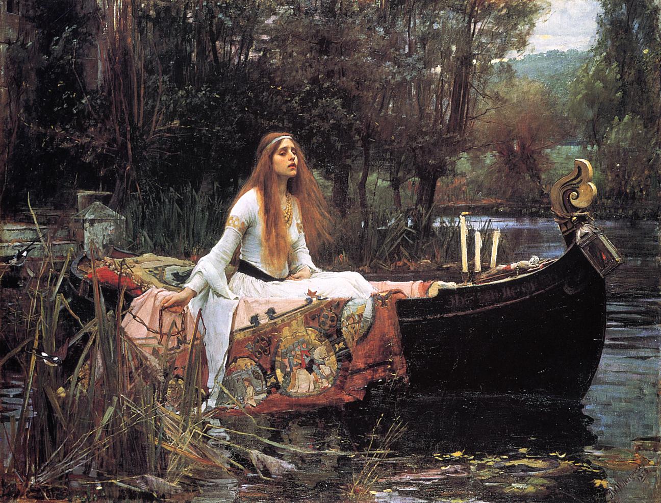 |
| The Lady of Shalott 1888 |
Slowly but surely as the styles of the artworld began to shift, Waterhouse went on to adopt the Pre-Raphaelite belief that nature should not be manipulated to suit our pleasure but captured as the eye sees it. One of the acknowledgements of the Romantic Era was that nature would always prevail and come to reclaim the transient creations of mankind. So to artists like Waterhouse, painting nature (including the human form) in anyway that was not honest simply for the sake of what was considered "pretty"...was mundane and just reflected the arrogant folly of man.
 |
| Ophelia 1889 |
John William Waterhouse stands out in the fact that he is a stylistic mush. While his subject matter conforms to the Classical, his depiction of physical beauty was governed by the fashions and beauty of his time period, his visuals are Romantic/Pre-Raphaelite, while his execution went from refined to almost impressionistic. If there's one thing that he mastered however, it was the ability to seamlessly intergrate his characters into their environments making them part of the landscape. Rather than his paintings illustrating the supposed human dominance over nature, he reminds us of the human imperfections and that humans, in all our "glory" are only a part of the violent and natural world.
While he is only one of the many forces altering the constraints of art of his era, I learn that we can always strive to fight the accepted norms of the art world. Even today we have criteria or what is art and how it's prevalent to our modern society...its going to changed again but only if people like Waterhouse push the boundaries and explore new potential.
 |
| Borea 1903 |
 |
A Sick Child brought into the Temple of Aesculapius 1877 |
 |
| Miranda -- The Tempest 1916 |
 |
 |
| Hylas and the Nymphs 1896 |
Malente

Malente has started a new record label called NO BRAINER. He is our favorite German of all time. (we like him even more than Katarina Witt)
Can't say enough good things about this guy - but more specifically his production is next level. To celebrate the launch of the label he's done a new dj mix. This would be a great way to kickoff your weekend.
Subscribe to:
Posts (Atom)


